Related Articles
- Bizarre Wonders: Crafting Functional Ornaments from Obsolete Household Gadgets and Oddities
- Eco-Chemistry: Innovative Projects Using Upcycled Materials from Your Kitchen for Sustainable Living
- Mystical Metamorphosis: Crafting Enchanted Home Decor from Unwanted Childhood Toys and Forgotten Doll Parts
- Color Cravings: Exploring the Unconventional Links Between Food Choices and Fashion Statements
- Hues of Controversy: The Surprising Ties Between Color Choices and Ethical Consumerism Trends
- Color Waves: Exploring the Impact of Music on Visual Aesthetics in Art and Fashion Choices
The Psychological Impact of Color Choices in Branding: Beyond Aesthetics to Consumer Behavior
The Psychological Impact of Color Choices in Branding: Beyond Aesthetics to Consumer Behavior
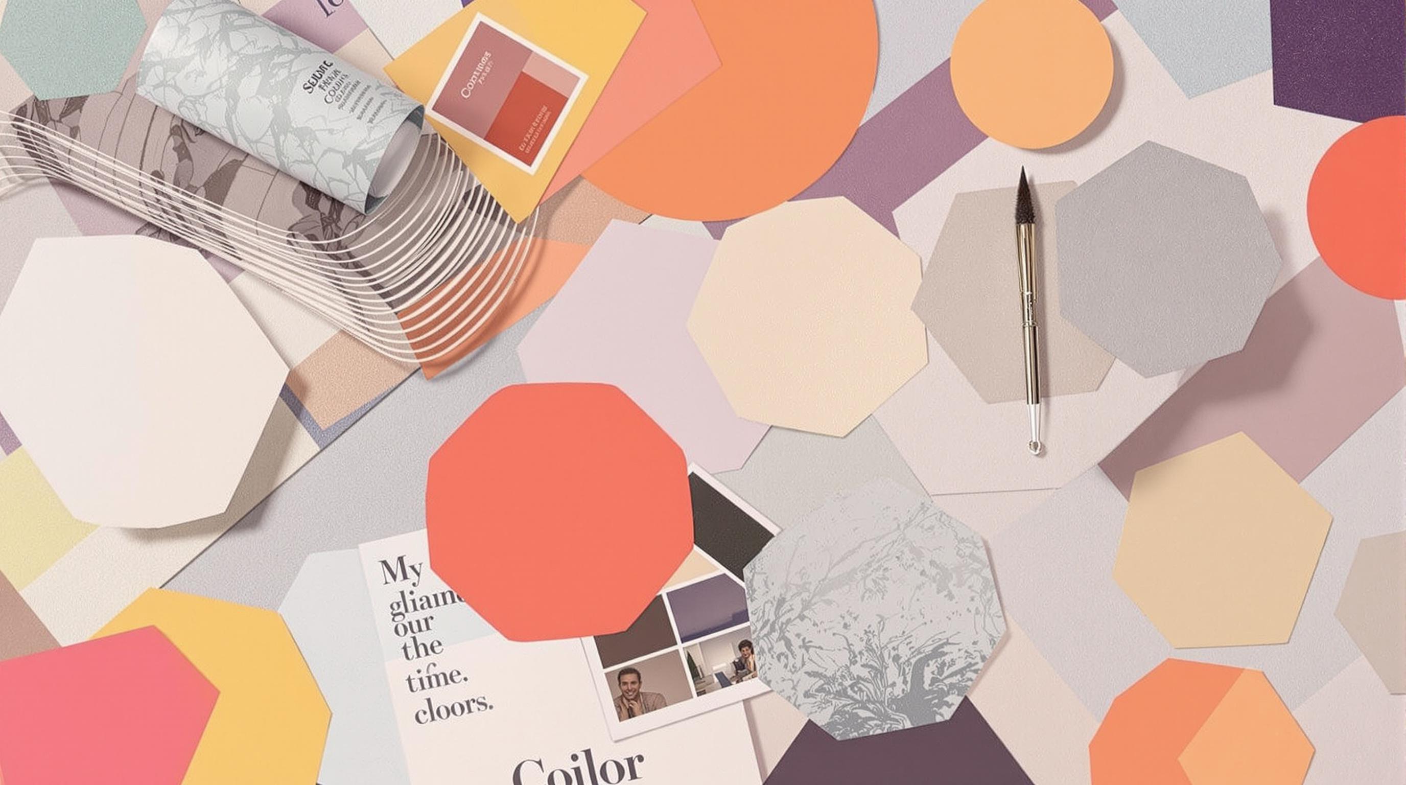
Color isn’t just a visual delight; it plays a crucial role in shaping consumer perceptions and behaviors. This exploration dives deep into the psychology behind color choices in branding, the impact they have on consumers, and how brands can leverage these insights to create stronger connections.
The Psychology of Color: A Brief Overview
Colors are powerful tools. They evoke emotions, influence decisions, and create associations. For instance, did you know that 85% of consumers make purchases based on color alone? (Source: ColorMatters). When brands strategically choose colors, they’re not just aiming for aesthetics; they’re forging a psychological connection with their audience.
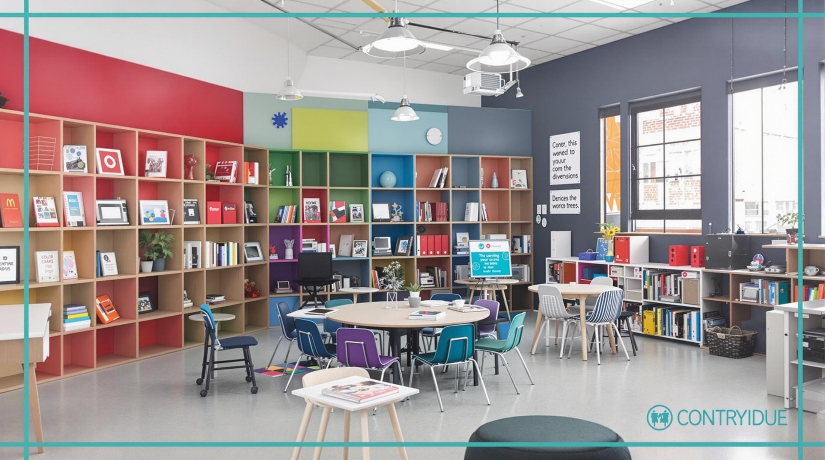
A Journey Through the Color Wheel
Picture this: you walk into a supermarket and are immediately drawn to the bright orange packaging of a snack. Why? Orange is often associated with energy and enthusiasm. In contrast, the deep navy blue of a financial institution can evoke feelings of trust and reliability. What do these color associations mean for branding? They mean that brands can align their messages with the emotions their colors evoke.
The Age Factor in Color Perception
Age plays a crucial role in color preferences. Research shows that younger consumers tend to prefer brighter, more vibrant colors, while older generations might lean towards subdued and classic shades. A vibrant red might scream excitement to a teenager, but to a 60-year-old, it could be just a tad overwhelming. Brands must be mindful of the demographic they are targeting, seamlessly integrating age-appropriate colors into their branding strategies.
Case Study: Coca-Cola vs. Pepsi
Let’s take a look at two beverage giants: Coca-Cola and Pepsi. Coca-Cola, with its iconic red and white color scheme, conveys excitement, passion, and energy. Pepsi, on the other hand, utilizes red, white, and blue, tapping into a feeling of trust, nostalgia, and a youthful vibe. Despite their similar markets, the psychological effects of their color choices help distinguish their brand perceptions.
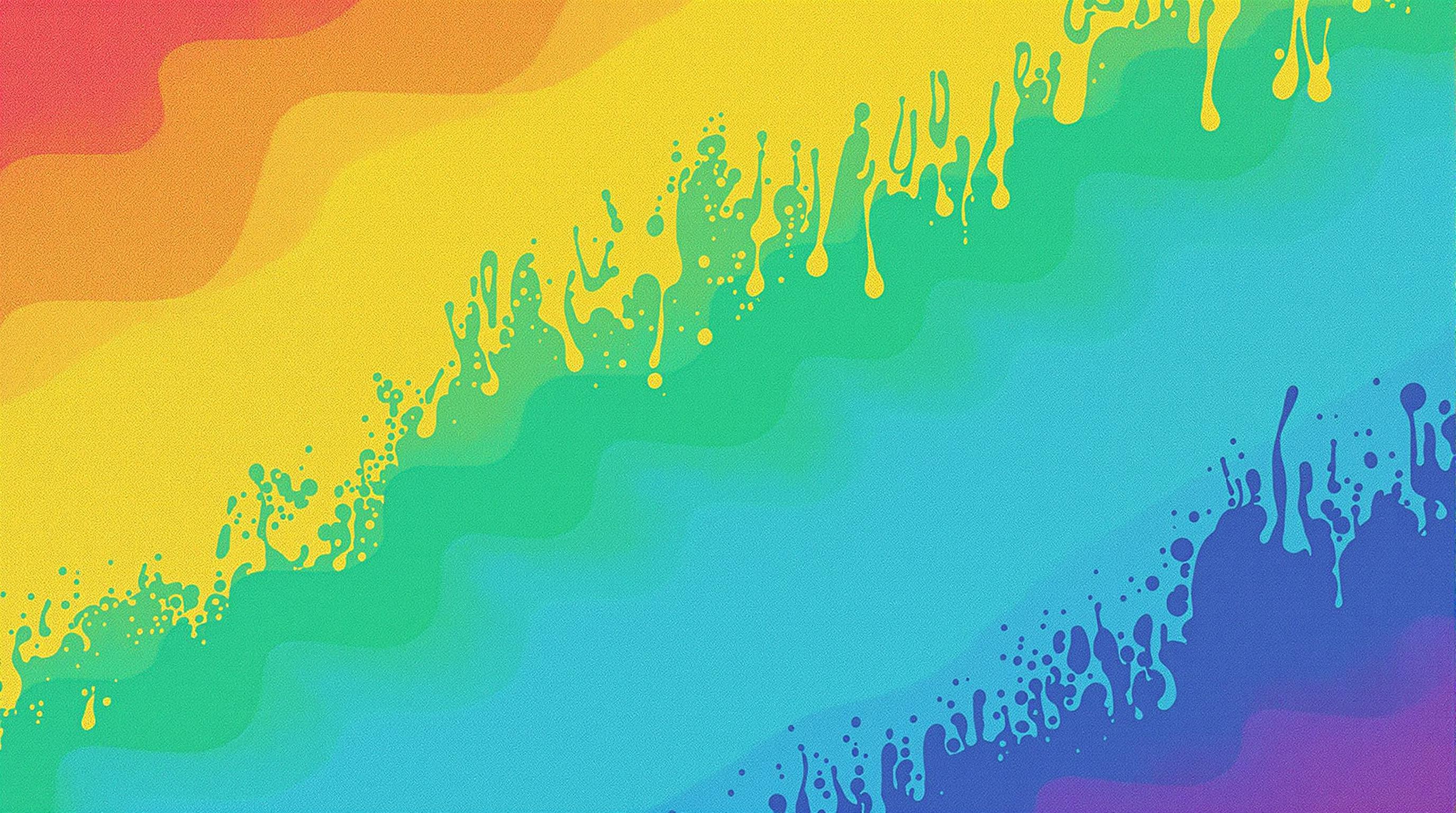
The Mood Spectrum of Colors
Think about the last time you made a purchase based on packaging. Perhaps the soothing green on an organic product suggested health and vitality. Color can dictate mood. Here’s a quick rundown:
- Red: Passion, urgency, excitement
- Blue: Trust, dependability, calmness
- Green: Growth, health, tranquility
- Yellow: Optimism, clarity, warmth
- Purple: Creativity, luxury, wisdom
- Black: Sophistication, elegance, mystery
- White: Purity, simplicity, freshness.
These emotions are universal, but their interpretations can vary based on cultural context.
Humor in Color Choices
Okay, picture this: a brand deciding to go with bright neon green for a funeral home. Odd, right? While humor is subjective, the mismatched expectation could lead to brand rejection. Choosing colors is not just about picking your favorites; it’s a strategic game of 'how will this color make consumers feel?'
The Power of Cultural Associations
Cultural differences can significantly impact how colors are perceived globally. For instance, while white is associated with purity and weddings in Western cultures, it symbolizes mourning and death in several Eastern cultures. Brands looking to expand internationally must navigate this colorful landscape cautiously to avoid their message getting lost in translation.
Engaging Target Audiences with Color Psychology
Branding is much more than just a logo; it's about creating an experience. Take Apple, for instance. The brand primarily uses sleek, minimalist colors that suggest sophistication and innovation. In this way, Apple doesn’t just sell electronics; it sells a lifestyle, and the color white is a critical part of that overall image. Recognizing and understanding the emotional undertone of colors helps brands communicate their identity effectively.
The Color Footprint of Social Media Brands
Social media platforms employ colors strategically as well. Facebook uses blue, which is often interpreted as reliable and trustworthy, while Instagram’s vibrant gradient sparks creativity and fun. Why do brands lean heavily into color usage? According to a study by the Institute for Color Research, color increases brand recognition by 80%—a remarkable statistic that emphasizes how color is often the first impression brands make.
Going Beyond Aesthetics: Practical Applications
Brands can use a variety of techniques to implement color psychology, such as:
1. **Creating Consistency**: Stick to a color palette that reflects the brand’s core values.
2. **Testing Color Variants**: A/B testing can be useful for identifying which colors resonate more with the audience.
3. **Using Color to Influence Actions**: Colors like red and orange typically encourage immediate action, which can be advantageous for calls-to-action in advertising.
4. **Emphasizing Brand Story**: Colors can embody a brand’s message—earthy tones for eco-friendly products or bold colors for revolutionary tech.
The Future: Staying Ahead of the Color Curve
What’s next for color in branding? As we progress through a world dominated by visual stimuli, the need for brands to evolve color usage dynamically increases. Innovations in technology, like AR and VR, will allow brands to engage consumers in ways that are even more immersive—changing how color and emotion interconnect in real time.
Final Thoughts
In the end, the choices brands make regarding colors are not mere whims. They are guided by psychology, consumer behavior, and deep-seated societal values. As a 25-year-old writer, I’ve seen brands rise and fall based on how they visually communicate, and color is undoubtedly a significant part of that narrative. Color decisions have lasting effects on consumer behavior—whether in-store or online—and building awareness around this fact is crucial for any brand looking to thrive in today’s competitive marketplace.
So, the next time you find yourself drawn to a specific product, take a moment to reflect on the colors at play. They are not just there to please the eye; they’re engaging your mind.
Read More