Related Articles
- Bizarre Wonders: Crafting Functional Ornaments from Obsolete Household Gadgets and Oddities
- Eco-Chemistry: Innovative Projects Using Upcycled Materials from Your Kitchen for Sustainable Living
- Mystical Metamorphosis: Crafting Enchanted Home Decor from Unwanted Childhood Toys and Forgotten Doll Parts
- Color Cravings: Exploring the Unconventional Links Between Food Choices and Fashion Statements
- Hues of Controversy: The Surprising Ties Between Color Choices and Ethical Consumerism Trends
- Color Waves: Exploring the Impact of Music on Visual Aesthetics in Art and Fashion Choices
Color and Culture: Uncovering How Global Traditions Affect Contemporary Design Choices
Color and Culture: Uncovering How Global Traditions Affect Contemporary Design Choices
Color is more than just an aesthetic choice; it’s a complex language shaped by cultural traditions and societal norms. This article explores how global traditions influence contemporary design choices, delving into the psychology of color, impactful case studies, and the importance of context in various cultures.
The Psychology of Color
Many studies suggest that color greatly influences our emotions and decision-making processes. A survey conducted by the Institute for Color Research found that 90% of snap judgments about products can be based on color alone. Want your designs to evoke trust? Consider blue; to incite passion? Red is your go-to.
Color Significance Across Cultures
It’s fascinating to observe how different cultures attribute varying meanings to color. For instance, in Western cultures, white is typically associated with purity and weddings. In stark contrast, many Eastern nations view white as a color of mourning and funerals. In India, the vibrant color saffron symbolizes purity and is often worn during religious ceremonies, while in Buddhist cultures, it stands for renunciation. This diversity calls for a nuanced understanding when designing for international audiences.
A Global Palette
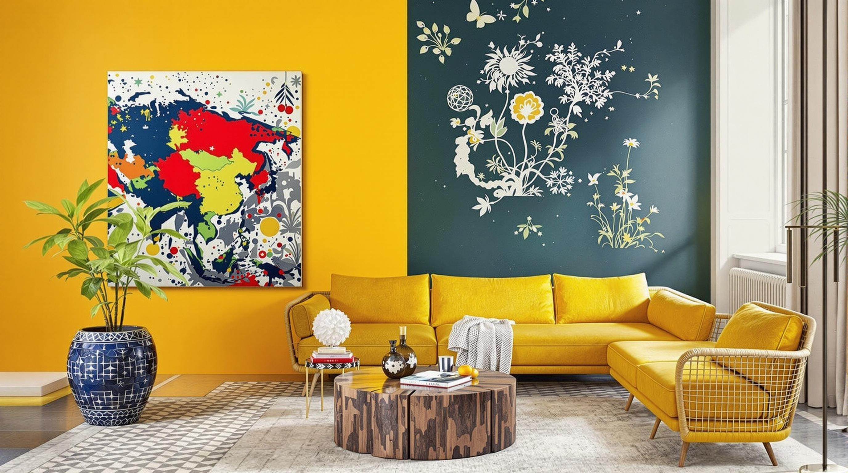
Imagine walking into a café that is painted a cheerful yellow. It’s inviting, isn’t it? But what if that café were located in a country like China, where yellow is considered an imperial hue reserved for royalty? Misunderstanding these cultural significances could lead to branding that feels out of touch or even offensive.
Case Study: The Success of Nike
Let’s dive into a fascinating case study involving Nike’s global marketing strategies. In 2018, Nike launched a campaign in China featuring the dynamic colors of the national flag - red and yellow - while advertising their signature sportswear. The designs were well-received, partially due to the emotional resonance of the colors with the local culture. Nike recognized how different hues could speak to consumer nationalism and pride.
Contrasting Design Choices
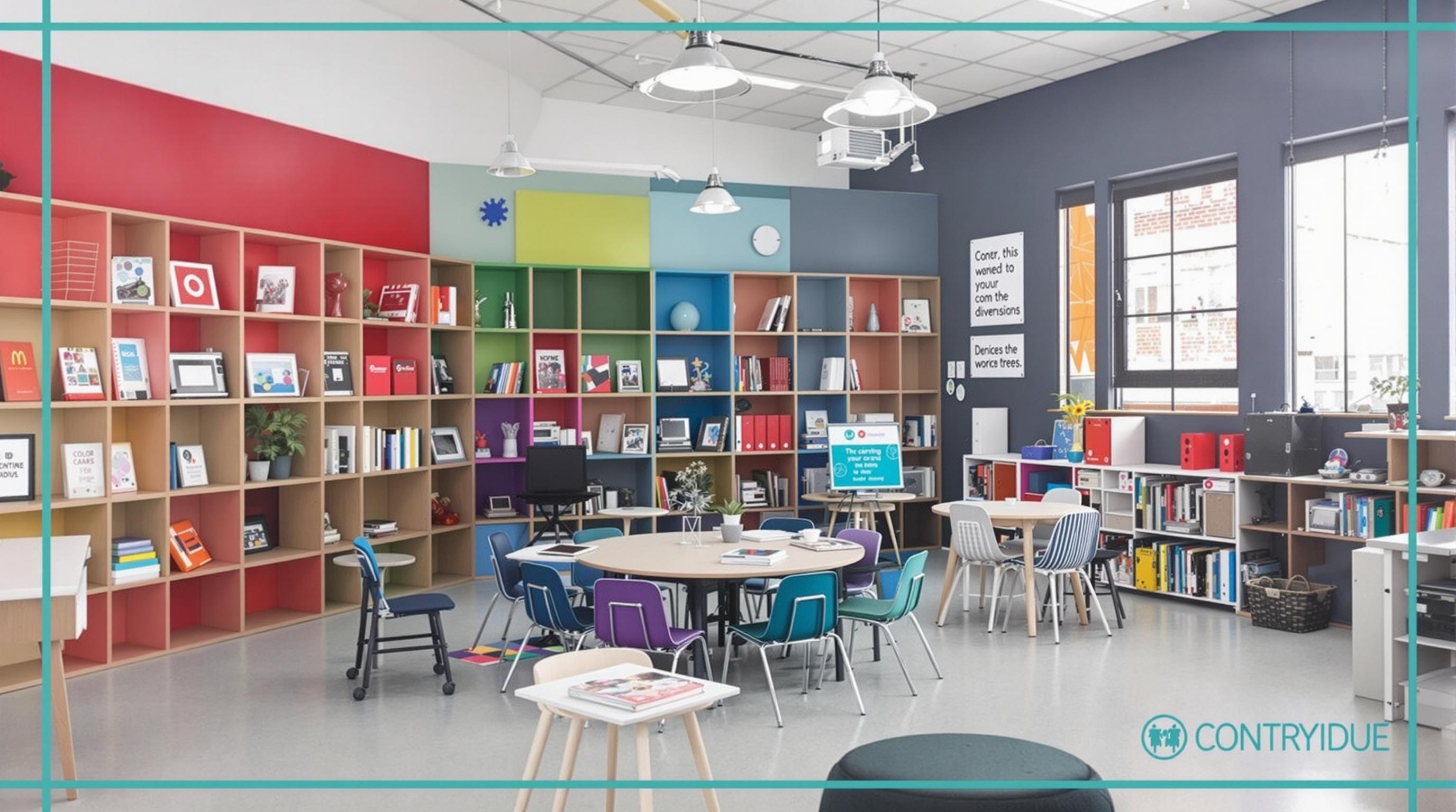
In sharp contrast, your average office environment in the United States might lean toward cooler tones like blues and greens, deemed to enhance productivity and focus. On the opposite side of the globe, Scandinavian design often combines neutral tones with bright pops of color, creating a balance meant to promote calmness and creativity. The prevailing belief resonates: color choices are not arbitrary and can set the tone of entire workplaces or public spaces.
The Role of Trendsetters
Influencers and trendsetters play an undeniable role in shaping color preferences in design. Take, for example, the rise of pastel colors in the 2010s across various design industries, largely propelled by social media aesthetics. Yet, the roots of these soft hues hark back to the 1950s and ’60s. The cyclical nature of trends often ties back to cultural nostalgia.
A Colorful Encounter
A unique encounter that clearly depicts the importance of utilizing local color narratives took place in 2015 in the coastal city of Cartagena, Colombia. Local artists began painting murals in bright, saturated colors that reflect Afro-Caribbean heritage and Spanish colonial history. The project redefined the cultural landscape, sparking tourism while fostering local pride, exemplifying how color can transcend mere design to heal and transform communities.
Boundary-Pushing Innovation
Now, let’s step into the tech realm. Companies like Apple and Google have been known to utilize color as a tool for innovation and user experience. The choices made in their UI and UX designs often echo cultural expectations and habits. Studies have shown that the average user associates certain colors with specific functions: green for “go,” red for “stop.” This makes it critical for designers to think about how their color choices will resonate globally while being user-centric.
Global vs. Local: A Tightrope Walk
The challenge, therefore, lies in the balance between being globally appealing while respecting local traditions. Major corporations face backlash when they misinterpret cultural meanings; take, for instance, the case of a popular fast-food chain that once used a color scheme for its new branding that unintentionally evoked funeral imagery in a specific culture.
A Call to Action for Designers
Designers must remember that the essence of good design transcends mere aesthetics. It’s a cultural dialogue. More than 70% of consumers are more willing to buy when they feel that a brand respects their cultural values (Source: Nielsen). Therefore, understanding local color traditions is not just advantageous but essential for strong, impactful branding.
The Digital Age and Color Choices
As we navigate an increasingly digital world, colors may take on new meanings. The rise of artificial intelligence and machine learning will facilitate designs that aren't just visually appealing but also culturally relevant. Self-learning algorithms will likely begin to customize color schemes based on users’ cultural backgrounds, preferences, and local traditions, bringing an entirely new dimension to design.
Why Humor Matters
Lightheartedness can also be a brilliant design tool! Imagine a quirky campaign featuring vibrant, clashing colors. While humor may not be color-centric, it certainly makes a statement in the design space by invoking joy and playfulness, which is universally engaging. Memorable branding often elicits a smile, ultimately leading to brand loyalty and stronger customer connections.
Cultural Inspirations
For many contemporary designers, paying homage to traditional crafts offers a unique way to pay respect to color’s cultural heritage. For instance, rugs from Morocco often feature a vibrant interplay of colors that tell a story of the artisan's background. This marriage of tradition and modern design isn’t just innovative; it celebrates and protects cultural identities.
The Future of Color in Design
With global movements toward sustainability and ethical practices, the future of color in design will also include considerations about the environmental impact of creating and utilizing certain colors. As Plato once wisely noted, “Colors are the smiles of nature.” Hence, ensuring that our palettes are sustainable means not just looking for a strip of color but ensuring it harmonizes with our ever-changing world.
Conclusion
The interaction of color and culture is a multifaceted subject that impacts all areas of design. In understanding the depth of cultural significance behind color, contemporary designers can create works that resonate on a global scale while remaining locally relevant. Let’s celebrate the vibrant tapestry woven by cultures worldwide and utilize that kaleidoscope to elevate our design choices.
So go ahead: reach for that unconventional color palette, dive into local cultural narratives, and remember that each design you create carries the weight of tradition. In the words of artist Paul Klee, “Color and I are one. I am a painter.” Let’s make sure color in design reflects the rich diversity of cultures around the globe!
Read More