Related Articles
- Bizarre Wonders: Crafting Functional Ornaments from Obsolete Household Gadgets and Oddities
- Eco-Chemistry: Innovative Projects Using Upcycled Materials from Your Kitchen for Sustainable Living
- Mystical Metamorphosis: Crafting Enchanted Home Decor from Unwanted Childhood Toys and Forgotten Doll Parts
- Color Cravings: Exploring the Unconventional Links Between Food Choices and Fashion Statements
- Hues of Controversy: The Surprising Ties Between Color Choices and Ethical Consumerism Trends
- Color Waves: Exploring the Impact of Music on Visual Aesthetics in Art and Fashion Choices
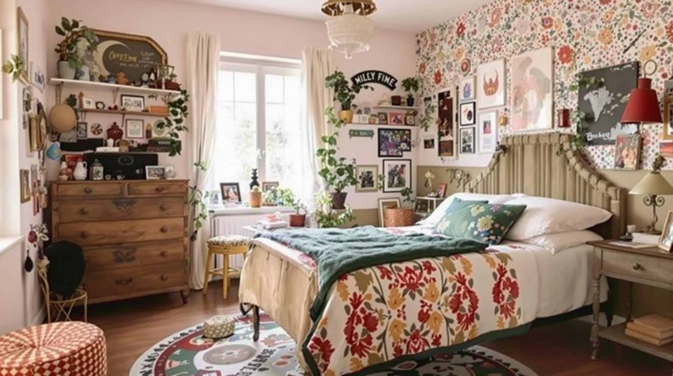
The Color of Sleep: How Unexpected Hues Affect Your Bedroom Mood and Restfulness
The Color of Sleep: How Unexpected Hues Affect Your Bedroom Mood and Restfulness
Colors are more than just a feast for the eyes; they hold the power to influence our emotions, behavior, and even the quality of our sleep. In this article, we will explore how different hues can transform your bedroom's mood and promote restful sleep, illustrating the science behind color psychology along the way.
The Psychology of Color
Color psychology is a fascinating field that studies how colors affect our mental state and emotions. According to research conducted at the University of Queensland, colors can have both psychological and physiological effects on us. Different tones can stimulate various responses: blues can promote calmness, while reds might increase energy and alertness. This is significant when considering the space where we spend a significant amount of our time—our bedrooms.
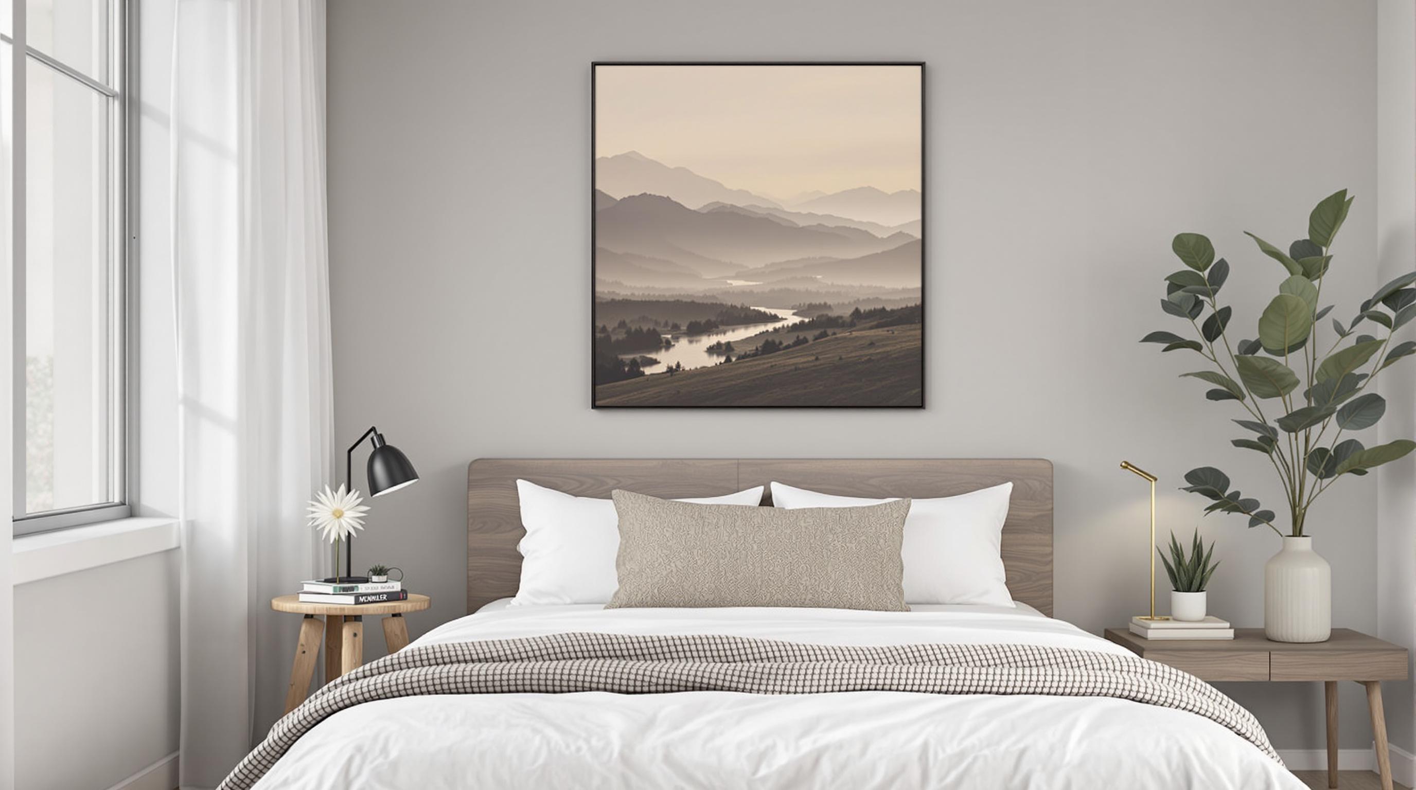
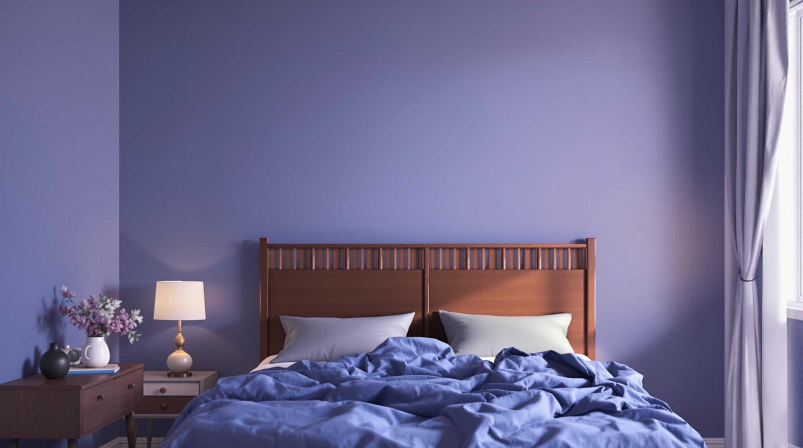
Cool Blues: Embracing Tranquility
Consider a serene blue—the kind that mirrors the sky on a clear day. This color has been scientifically linked to lower heart rates and decreased anxiety. In a survey conducted by the International Journal of Design, individuals who painted their bedrooms in shades of blue reported improved sleep quality and less stress compared to those who opted for bolder hues. There’s something incredibly soothing about immersing oneself in a space that reflects the calmness of nature.
For example, a soft, powdery blue can invite relaxation, while darker shades evoke sophistication. The contrast further emphasizes how various tones can achieve different effects; one is calming, while the other implies a sense of luxury. If you're battling sleep disturbances, painting your bedroom blue might be more than a cosmetic choice—it could play a crucial role in your sleep hygiene.
Case Study: The Blue Effect
A study conducted by the National Sleep Foundation found that bedrooms painted in blue reported higher levels of sleep satisfaction across demographics. Individuals aged 18-30 who adorned their rooms in lighter shades of blue claimed an average of 7 hours and 52 minutes of sleep per night—about 20 minutes more than those who preferred red or yellow. So, perhaps it's time to retire that bright crimson comforter!
Vibrant Reds: A Double-Edged Sword
Red is often associated with passion, power, and energy, but it's also one of the most polarizing colors when it comes to sleep environments. The color can raise blood pressure and heart rate, which might be great for a workout but not for winding down at the end of the day. According to a study conducted by the University of Southampton, participants sleeping in red or orange rooms reported feeling more fatigued than others sleeping in calmer colors.
However, this doesn't mean you must completely banish red from your color palette. Using it as an accent color—perhaps in a throw pillow or artwork—can add vitality to the space without overwhelming your senses. After all, balance is key to creating a restful retreat.
Creativity and Chaos: A Personal Anecdote
Let me take you back to my first apartment living in a vibrant red room with mismatched furniture. It was a chaotic yet exciting time in my life, filled with creativity and spontaneity; however, the nightly wrestling match with insomnia was something else. I vividly remember the antsy feeling every time I hit the pillow, stifling the very slumber I desperately craved. It wasn't until I added softer tones that I discovered the sweet embrace of restful nights!
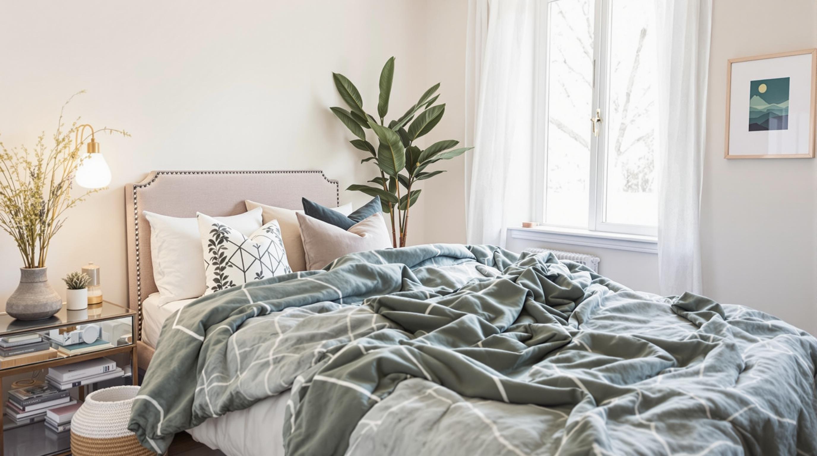
Soft Greens: The Healing Color
Green hues evoke feelings of freshness and tranquility, reminiscent of lush landscapes and idyllic meadows. Studies show that people surrounded by green reported feeling more relaxed and rejuvenated. The American Institute of Stress even highlights the mood-enhancing properties of nature-inspired colors, claiming they can lower stress levels.
In my conversations with friends, I've noticed that those who painted their bedrooms in soft, muted greens shared stories of their enhanced sleep quality. More than just aesthetics, it contributed to a holistic healing experience, allowing their minds to unwind and retreat from the daily grind. For anyone looking to cultivate a calming atmosphere, greens should definitely be on your radar!
The Power of White
White has long been synonymous with cleanliness, purity, and simplicity. While it can evoke feelings of spaciousness, too much white can feel sterile and cold—especially in a personal space like a bedroom. In a 2020 study published in the Journal of Environmental Psychology, participants expressed that stark white surroundings heightened their feelings of unease, particularly during the night.
The solution? Balance it out with warmer hues or inviting textures. A white room can be revitalized with wooden furniture, soft fabrics, or hints of pastel colors to encourage a cozy atmosphere without sacrificing the feeling of openness.
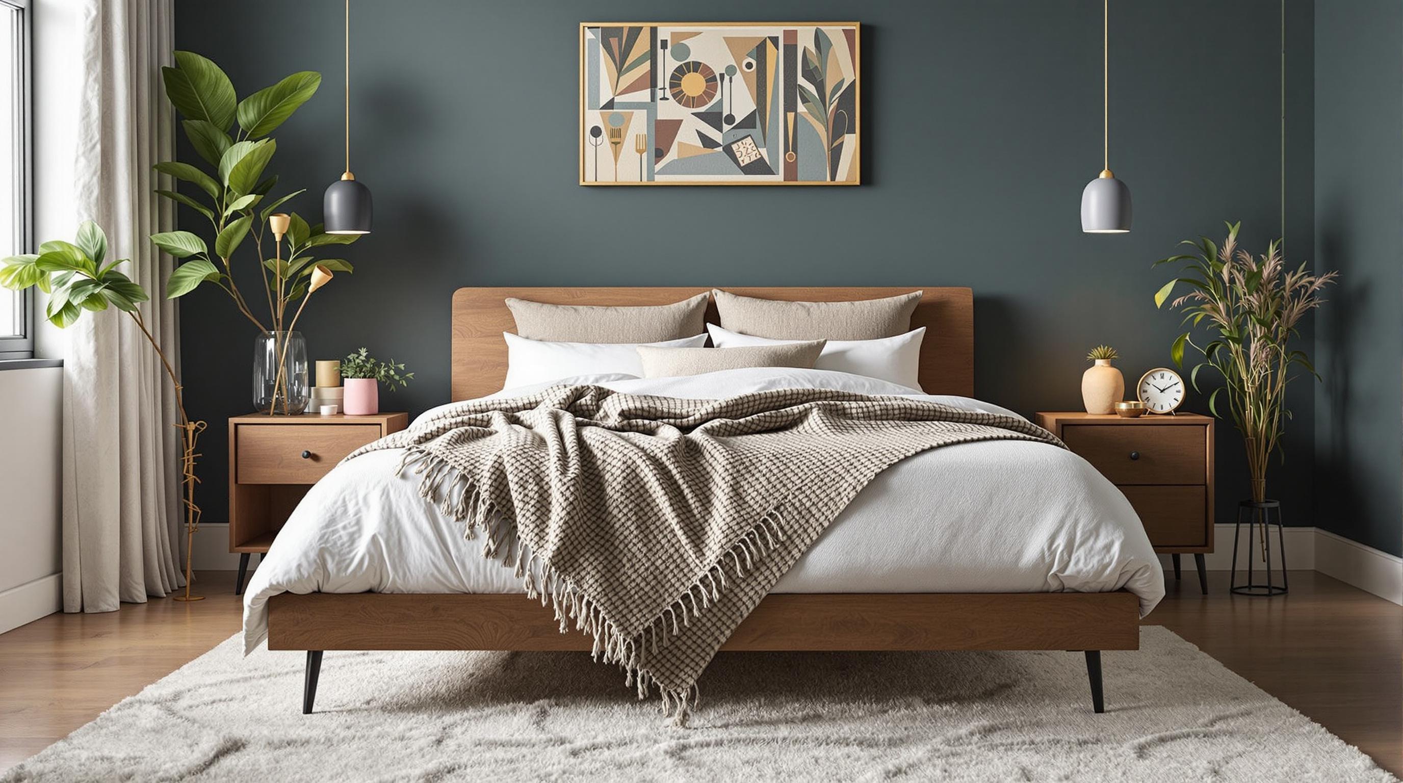
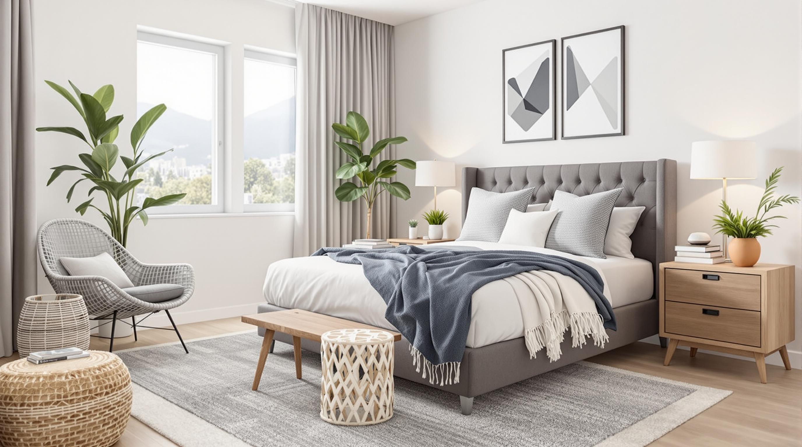
Gray: The Versatile Neutral
Gray can be both calming and sophisticated but is drastically influenced by the shade you choose. A light gray can create a serene environment, while a dark gray may feel heavy and overwhelming. According to data from the Daily Mail, homeowners who utilized gray tones in their bedroom reported mixed feelings—some found it restful, while others felt it was too cold and impersonal. Thus, it’s important to consider how you feel about gray and why you might choose it for your own space.
Making Gray Work for You
Utilizing gray as a base color can allow you to add splashes of vibrancy and warmth. For instance, vibrant cushions, artwork, or greenery can turn gray’s potential dullness into a canvas for personality and comfort. Balance and contrast can turn a monotonous gray room into a refuge of relaxation.
Personalizing Your Palette
Now that we've explored the effects of different colors, it's time to understand the importance of creating a personalized palette that reflects your unique style and emotional needs. Much like a tailored suit, your bedroom should embody your personality, infused with colors that resonate with your emotions and daily rhythms.
A survey conducted by Wayfair found that 72% of individuals cited color as a major factor in creating a welcoming atmosphere. This is a strong indicator of how our environments can play a pivotal role in our daily emotional regulation. The important takeaway here is that while color psychology is beneficial, individual responses to color can vary dramatically.
Consulting the Experts
If you're uncertain about which colors to choose, consider consulting with a color expert or interior designer. They can guide you in selecting hues that harmonize with your lifestyle, furnish your space with thoughtful accents, and foster a soothing ambiance conducive to restful nights.
Break the Mold: Create Your Own Color Harmony
Don’t shy away from rare combinations, either. Have you ever thought about mixing pink with teal or turquoise with mustard? Your bedroom is your canvas, and the more you experiment, the more you’ll discover what truly resonates with you. Play with different combinations until you land on something that sparks joy and invokes tranquility! After all, color, like dreams, is subjective and beautifully personal.
Lighting: The Unsung Hero
No discussion about bedroom mood is complete without mentioning the critical role of lighting. The source and quality of light can significantly impact how colors appear and, therefore, how they affect space. Illuminating a pastel-colored room with bright, harsh lights can transform the ambiance into something entirely unwelcoming, while the right soft, warm lighting can enhance its soothing qualities.
Studies show that warm white lighting can create a sleepy environment, making you feel safe and relaxed, while cool, fluorescent light might keep you awake and alert. Consider incorporating layered lighting—overhead fixtures, bedside lamps, and accent lighting—to cater to different moods and activities in your bedroom.
The Final Touches: Accessories Matter
Whether it’s an art piece, a rug, or a set of curtains, every accessory plays an important role in defining the mood of your sanctuary. Use accessories wisely to complement your color choices; for instance, if your walls are painted green, consider adding white or beige linens and decor to balance the room. Placing accent pieces that resonate with your emotional needs can help refine and ground your space for a more peaceful experience.
Conclusion: Discovering Your Dream Palette
Your bedroom should be a reflection of your individuality while also serving as a sanctuary for rest and rejuvenation. The colors you choose can profoundly influence not just the aesthetics of your space but also your emotional well-being and sleep quality. Take the time to explore, experiment, and ultimately craft a space that brings you peace and comfort. In the end, whether you embrace earthy greens or bold reds, the goal remains the same: discover your personal palette and let it guide you to achieving the restful nights you crave.
So, what are you waiting for? Unleash your creativity and start playing with color—it’s time to turn your bedroom into a dreamy oasis tailored just for you!
And remember, the best sleep is just a coat of paint away!
Read More